Price Upon Request #23: TEFAF
The only fair I go to.

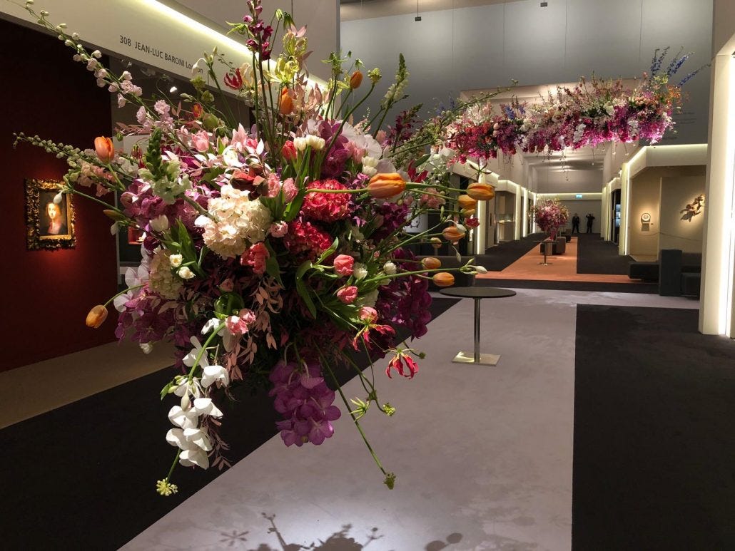
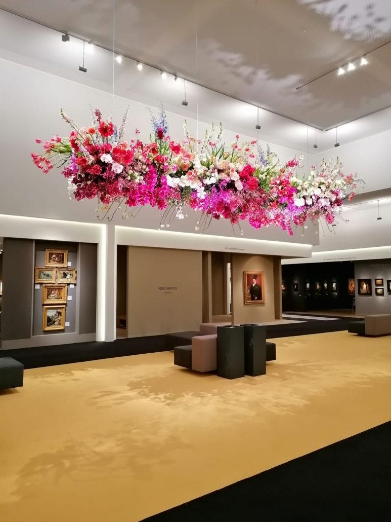
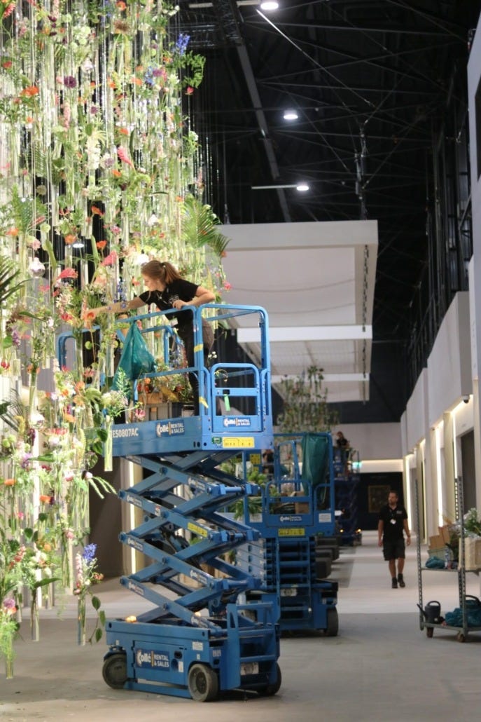
It’s art and design week in New York, and honestly I don’t really care about the slew of fairs, shows, and various high end beverage-sponsored events, with one major exception: TEFAF. There is no fair quite like TEFAF. It is perhaps the most beautiful and civilized event of the year. You can enjoy oysters and champagne alongside the well-dressed Italians who flew in for the week, while admiring the famously impressive floral arrangements that have become a draw all by themselves. (Though it does feel like they’ve scaled back on the flower budget in recent years, can someone please deal with that?)
These trappings are ultimately in service of a fair that brings together centuries of fine art, design, and jewelry, all of the highest caliber. Unlike other fairs who make the claim, TEFAF feels truly equal parts art and design. I also find it particularly pleasing to be able to see 1st century Roman sculpture alongside some of my favorite midcentury French furniture.
Since the fair does go for another two days (through May 19th), I thought I would round up my favorite things on view (that are also for sale, so I am actually not straying from my normal structure!), allowing you, should you feel so inclined, to see them in person (which I do highly recommend.)
I’ll start with what are tied as my two favorite contemporary ceramic pieces at Adrian Sassoon. Because they’re in the same booth, I am giving myself an exception as I am not sure I can choose between them. One of them is actually by my brilliant friend Kate Malone, a British ceramicist and glaze researcher. There are three pieces of hers on display this year that I love equally, but for the sake of this newsletter I will highlight the one that initially caught my eye.
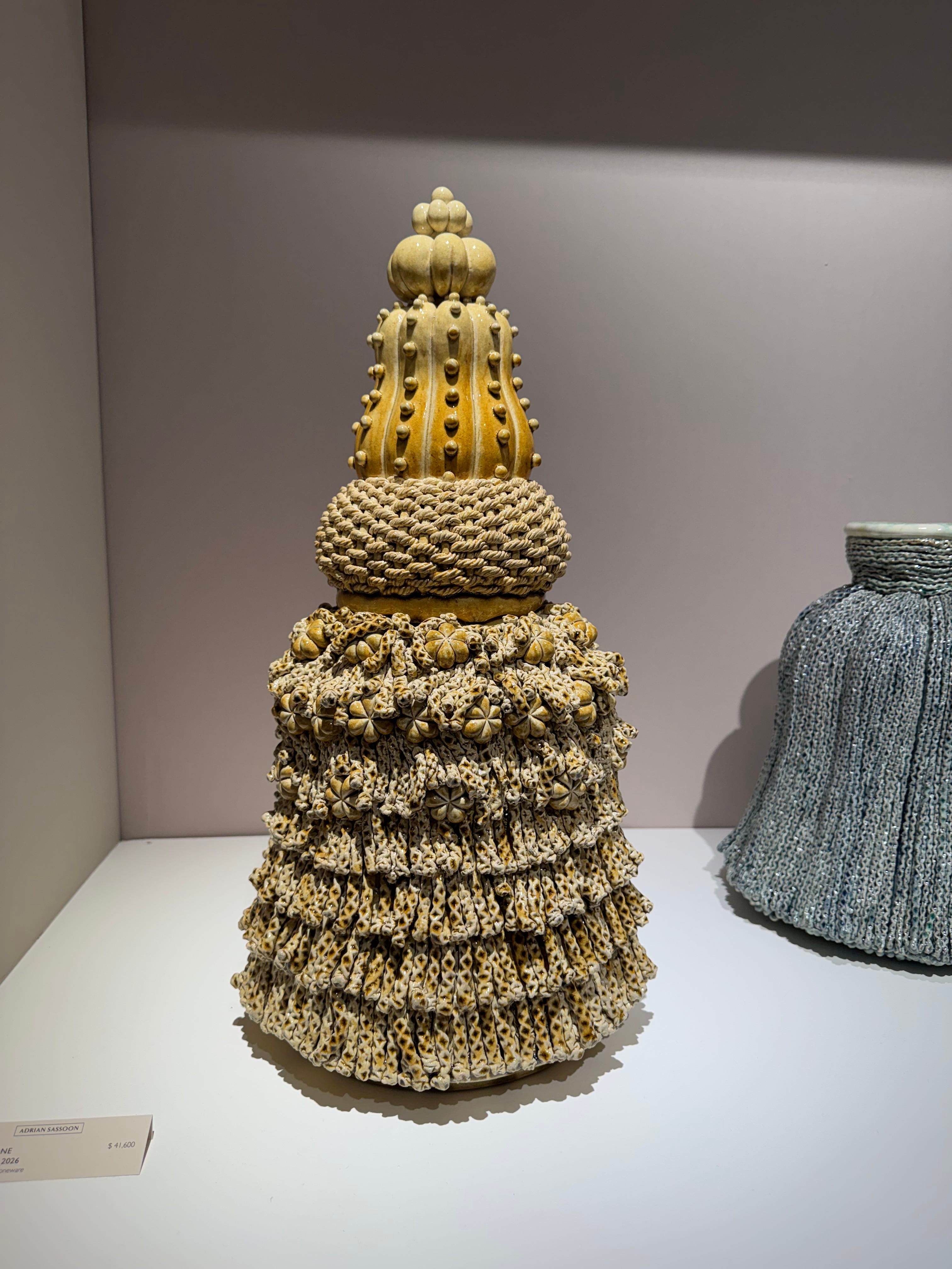
Kate's work leans in a few different directions, some pieces more abstract consisting of large geometric volumes, real showcases of her extensive glaze research. Others have a more traditional feel, rooted in natural forms. This one combines a few of her signature elements I love: a beautifully woven rope, a pumpkin pyramid, all atop a tasseled vessel that almost appears in motion. I am also a sucker for monochrome work, especially one as dynamic as this.
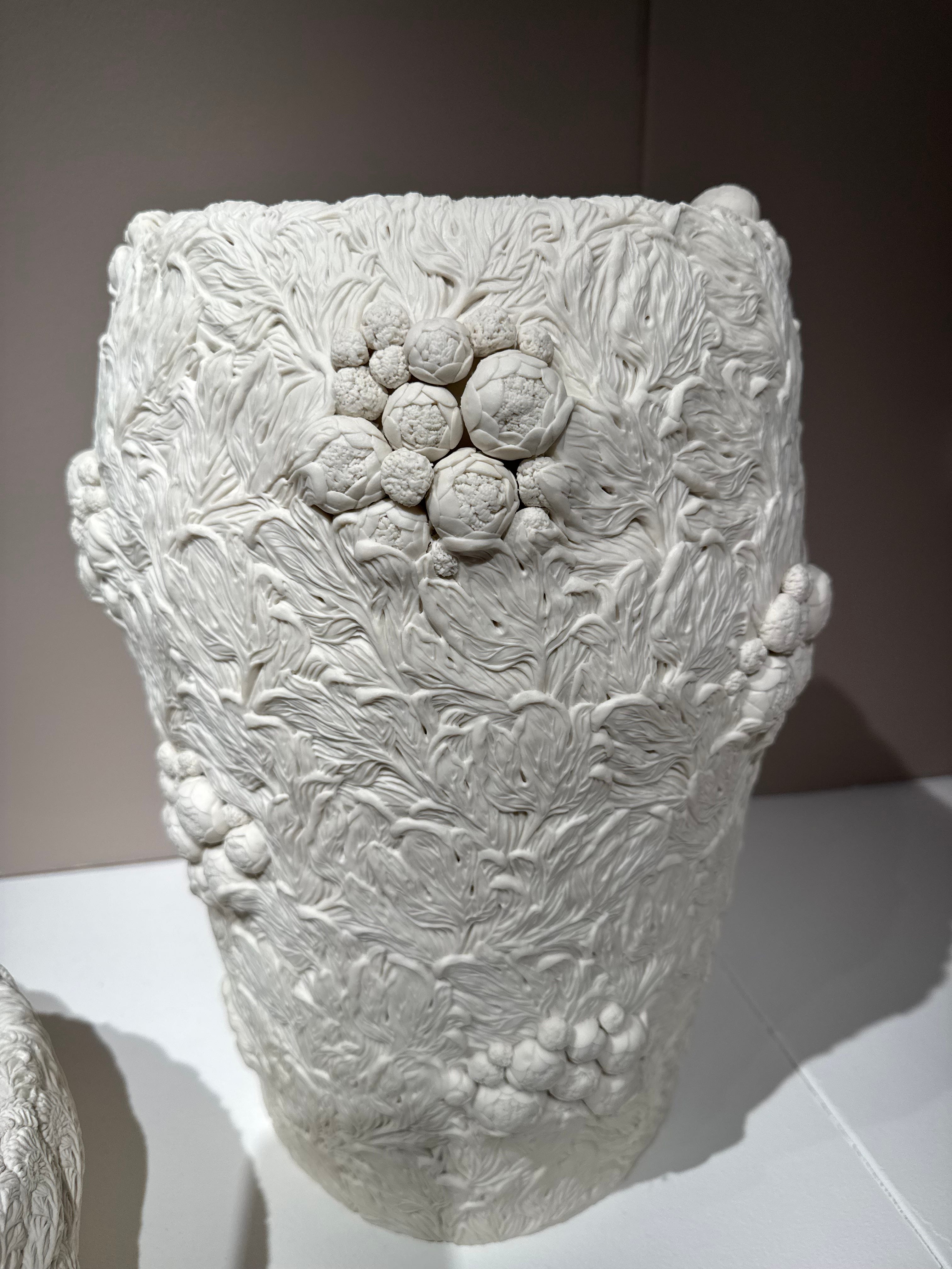
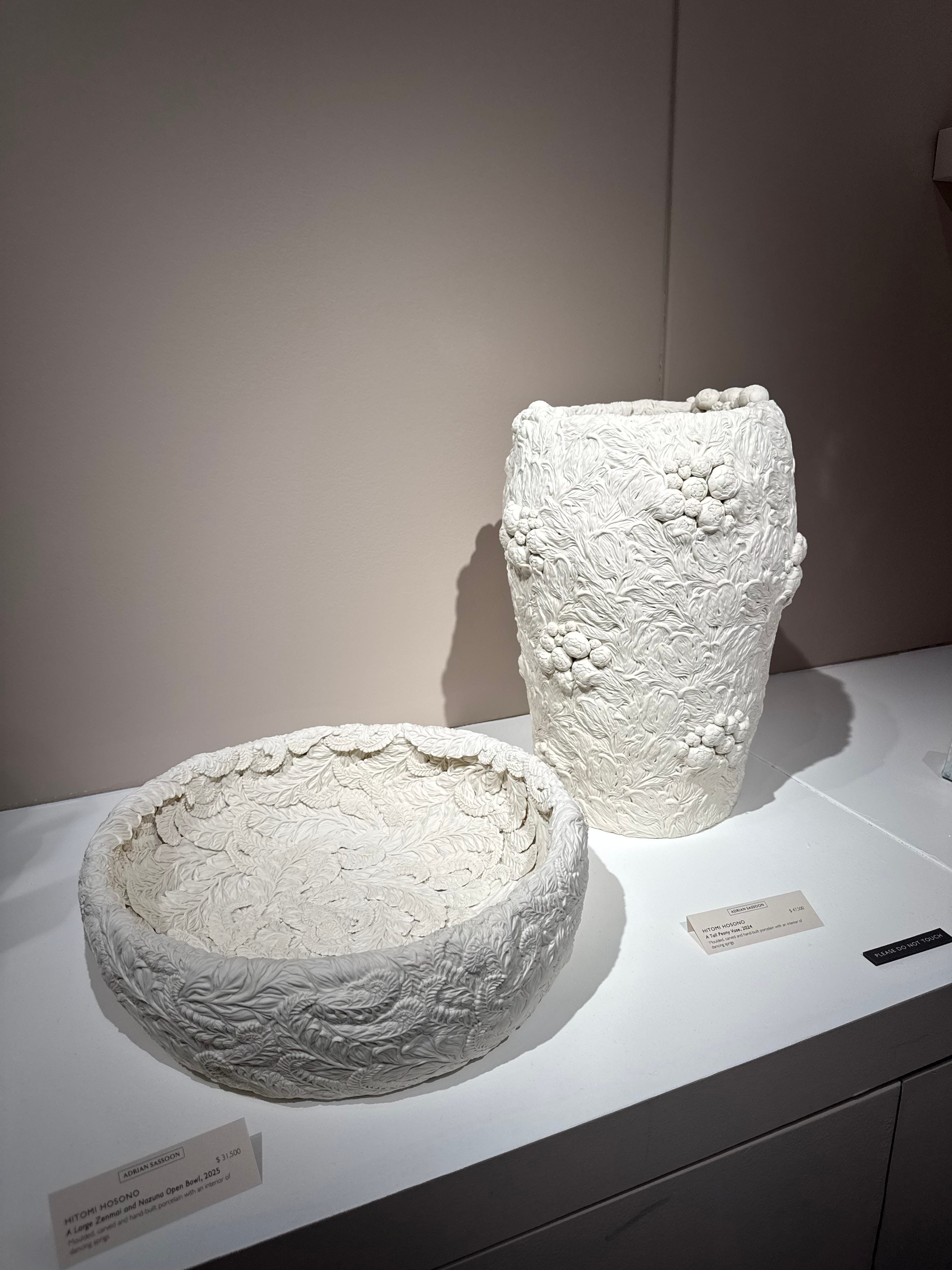
Speaking of monochrome—I am always blown away by Hitomi Hosono’s work. Her moulded and carved porcelain vessels contain a level of detail you’d have to be truly sick not to appreciate. Peony buds are one of nature’s most satisfying forms, but seeing them in miniature in matte white porcelain clusters…It is something else, let me tell you. Part of Hosono’s magic is that the detail on the outside of her vases continues throughout the interior of the vessel, making them all the more beautiful. (Another reason you should go see them in person)
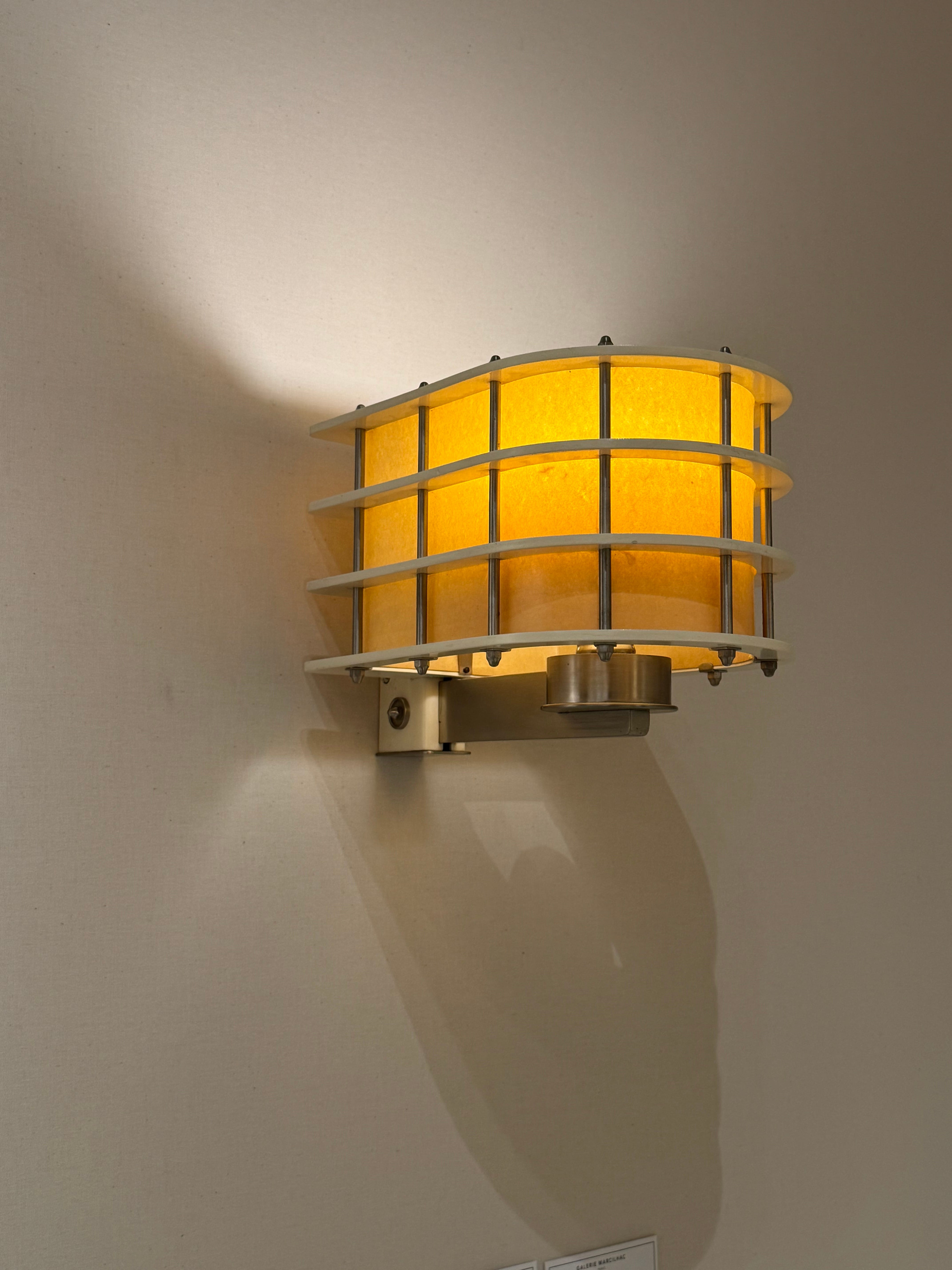
Paul Dupré-Lafon is one of my favorite mid-century French designers, but I had not seen this sconce before. This is the kind of sconce that makes you realize no one is doing enough when it comes to lighting. For a nickel plated aluminum structure with lacquered steel blades, it reads incredibly warm and gentle. A parchment shade we know will do that, but paired with such rigid materials, its effect seems to be even stronger. This is a truly perfect fixture to me.
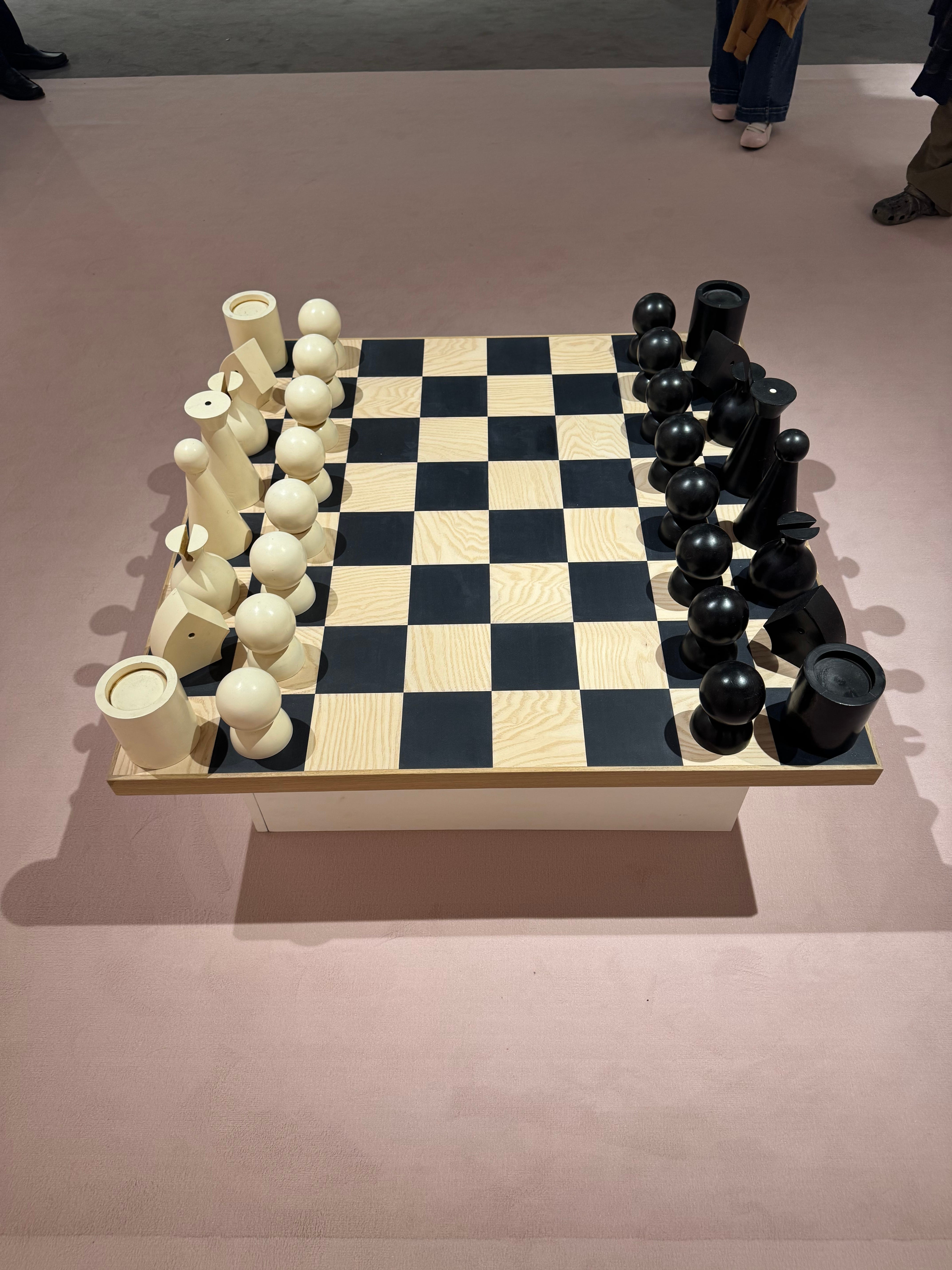
This Man Ray oversized chessboard is fabulous to me. I would literally host the most gorgeous chess party around this board. Also, this rug is a great shade of pink.
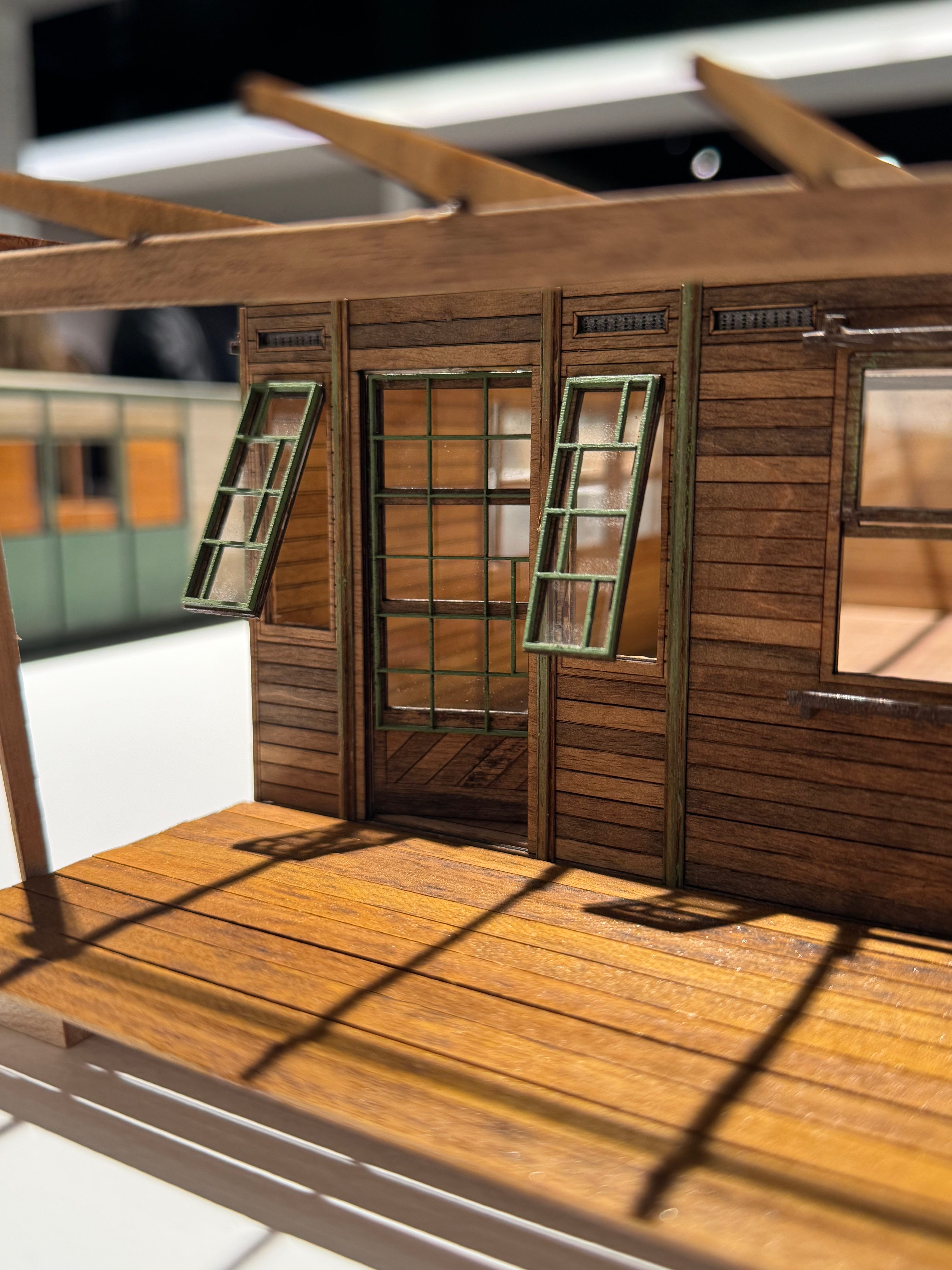
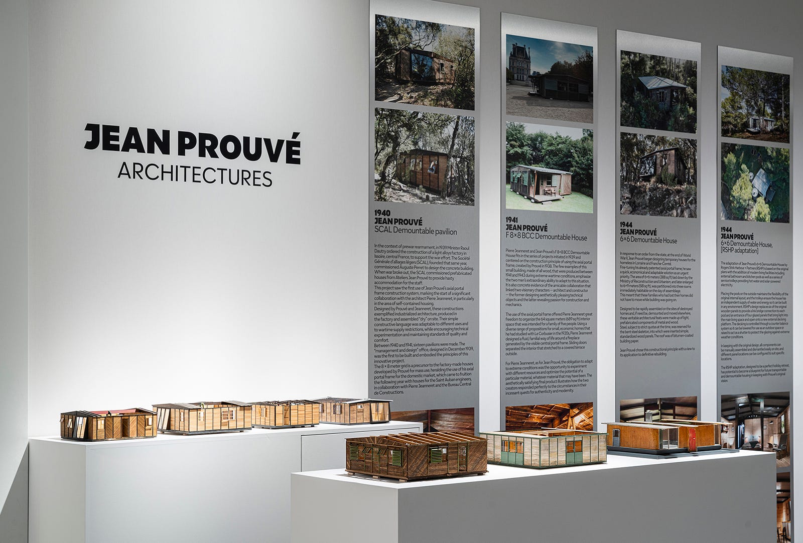
It’s always a pleasure to see the Prouvé models of Patrick Seguin. This year the display featured a collection of 12 demountable structures designed by Prouvé between 1939-1956. This one was my favorite. It just feels so.. cozy, for Prouvé. Not a word I would ever normally use to describe his work.
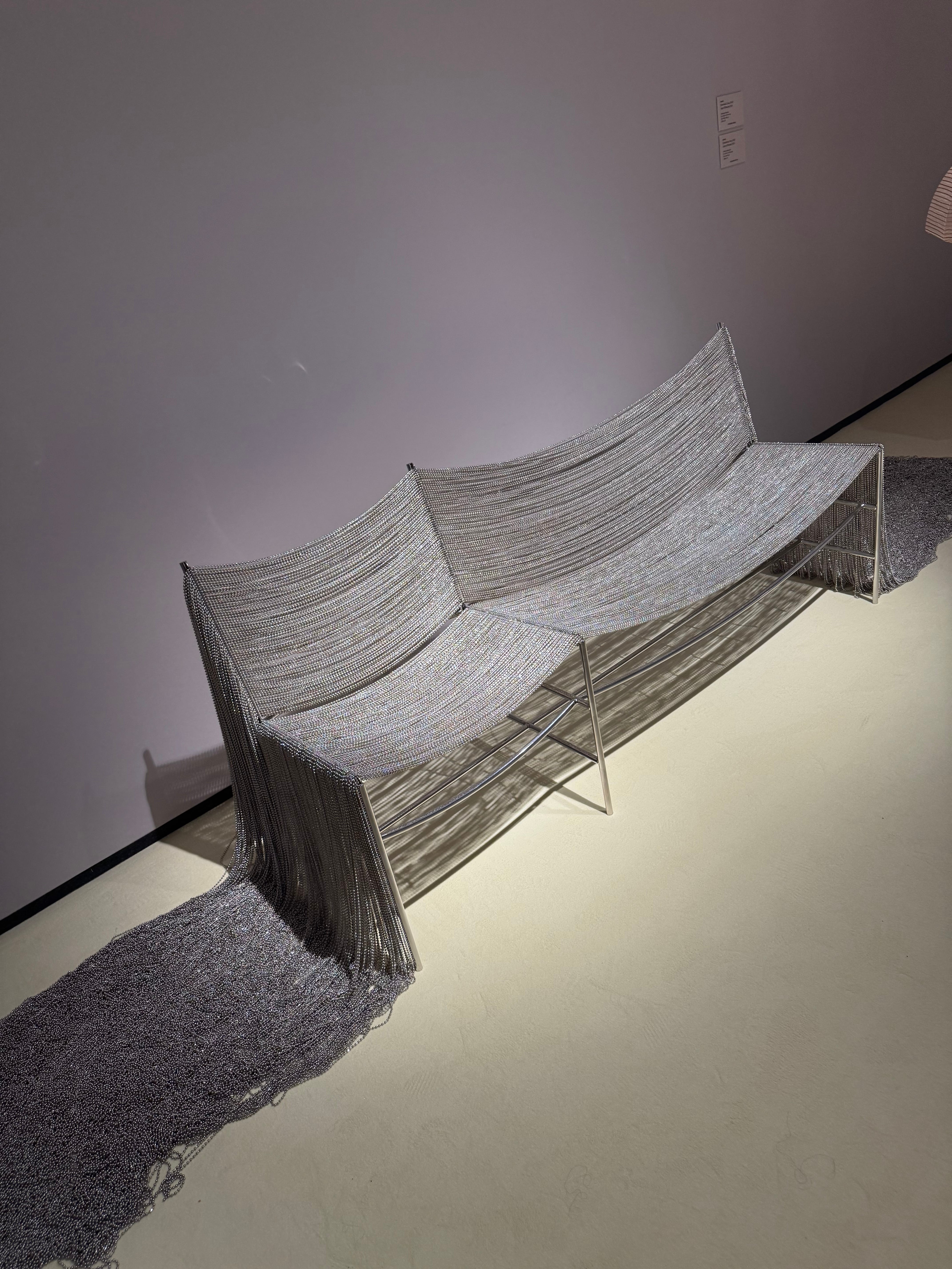
Despite being made of nothing but a steel frame and nickel ball chain, this bench is anything but stiff. I appreciate an effort to make metal feel soft and this does just that—a traditional silhouette turned soft and slinky? It's kind of sexy. The way it catches the light is fantastic, and must be seen in person.
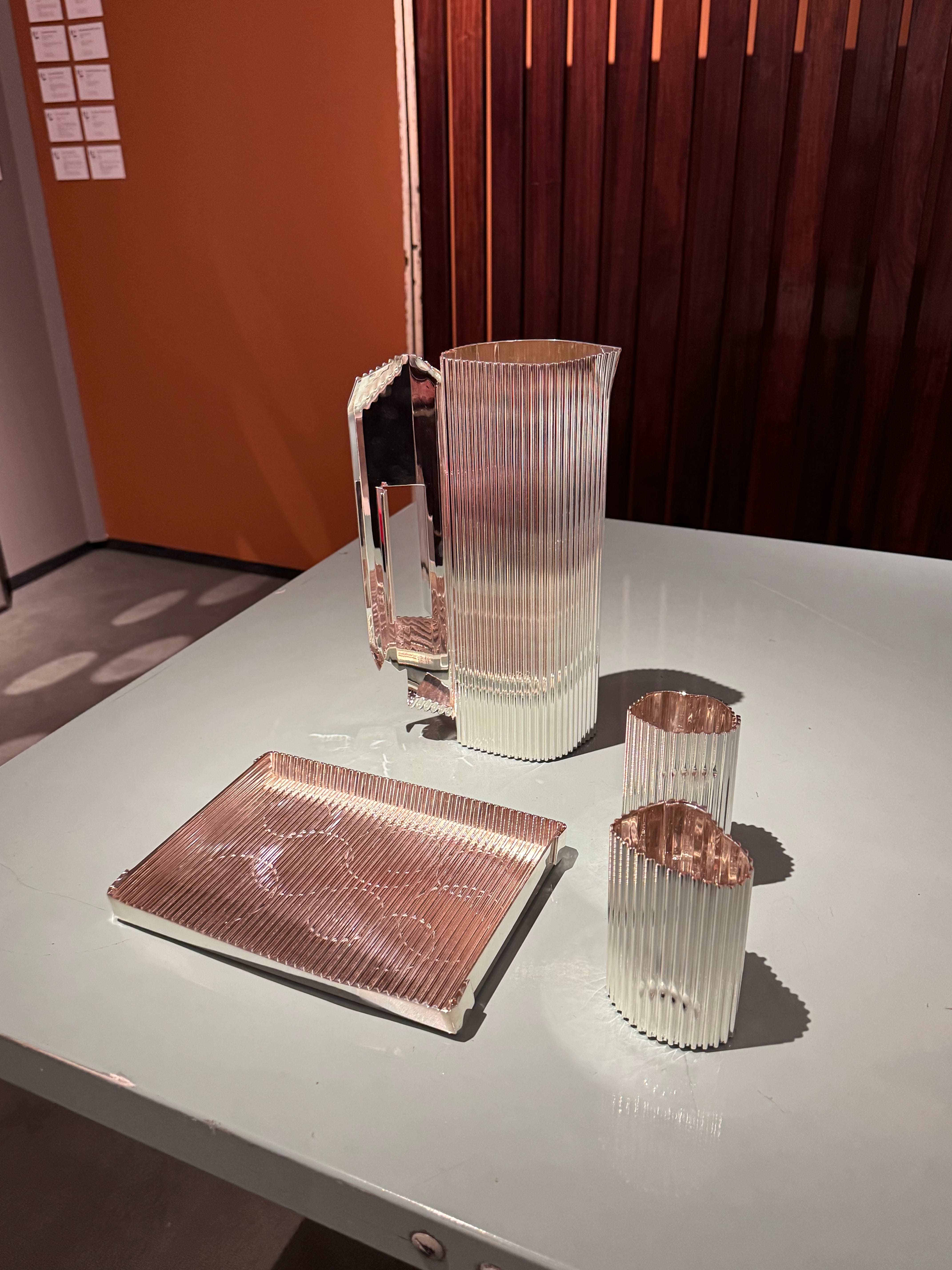
Architects talk about Rachel Whiteread too much. I find it annoying, and it has kind of killed my appreciation for some of her work, but this feels so contextually different that I feel okay highlighting it. If you read this newsletter you know I have a weakness for silver collaborations with artists/architects, and this one is just. really. good.
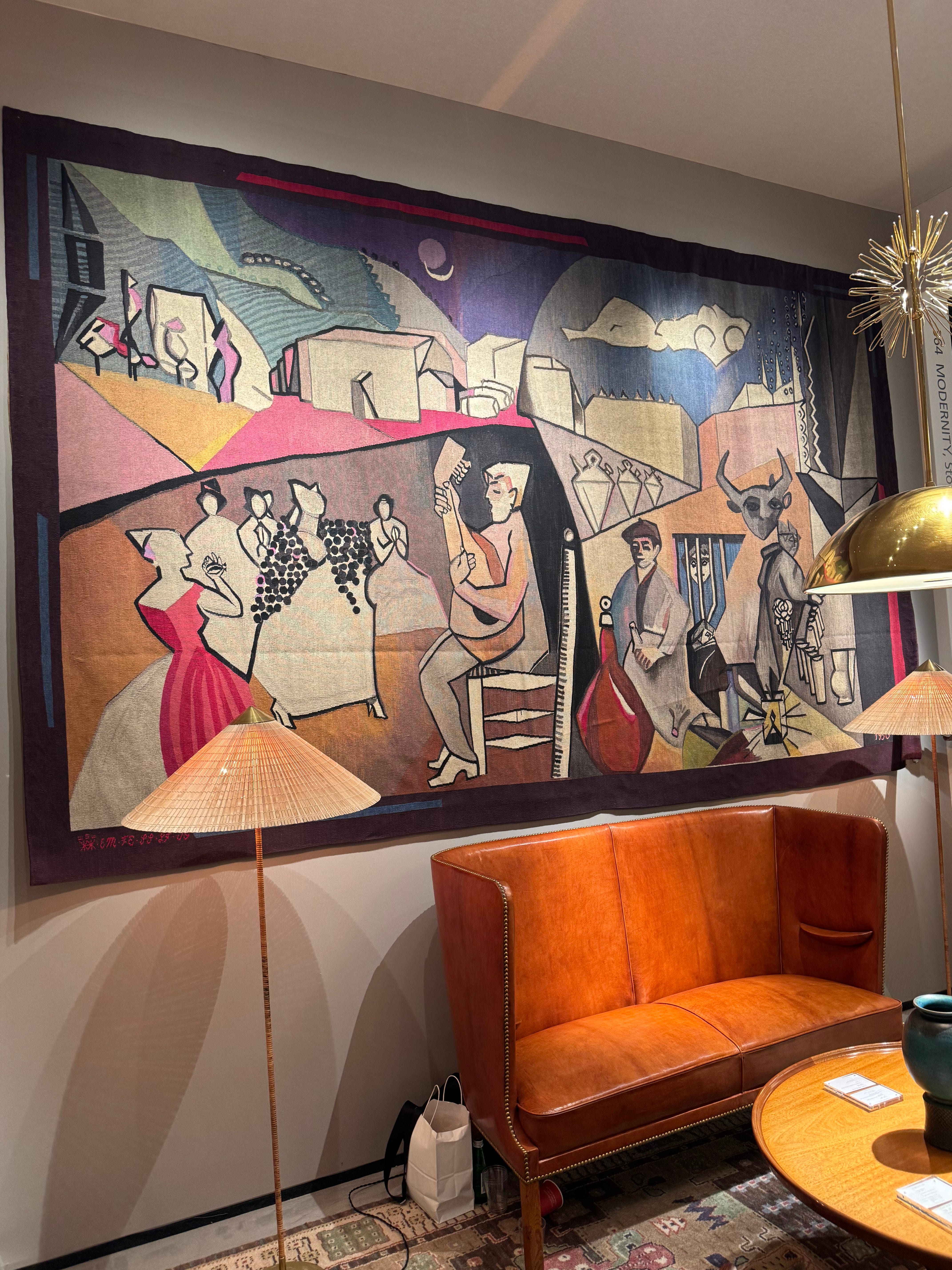
And finally, the Swedish tapestry that stole my heart! I also insist you go see this in person because the colors feel a bit washed out in the photo. I didn’t know I had a special place in my heart for midcentury Swedish tapestry, but it turns out I do! I also just love the title Nighttime Party, for a carpet nonetheless.